← Back to Portfolio

Brand + Product Case Study

VentureVerse

Travel Scrapbooking App + Style Guide

VentureVerse is a travel-inspired digital scrapbooking app concept created to help users capture, organize, and share unforgettable travel experiences. This collaborative project focused on building a complete brand system including strategy, logo design, UI components, personas, typography, visual language, and product identity for both web and mobile experiences. :contentReference[oaicite:0]{index=0}
VentureVerse brand preview

Project Overview

The goal of VentureVerse was to create a memorable digital product for travelers who want more than a standard photo gallery. Instead of simply storing images, the platform transforms trips into scrapbook-style stories with customizable visuals, creative layouts, and a community built around exploration. The project required us to think like both brand strategists and product designers. :contentReference[oaicite:1]{index=1}

Problem + Solution


The Problem

Many travel apps focus on booking, itineraries, or static photo storage, but they do not fully capture the emotional storytelling side of travel. Users often lack a fun, visually engaging space to preserve memories, express creativity, and inspire future adventures.

The Solution

VentureVerse combines travel memories with scrapbook creativity. Users can document trips through photos, overlays, decorative elements, and personalized layouts while also discovering destinations and connecting with other travelers.

BRAND STRATEGY

Mission + Identity

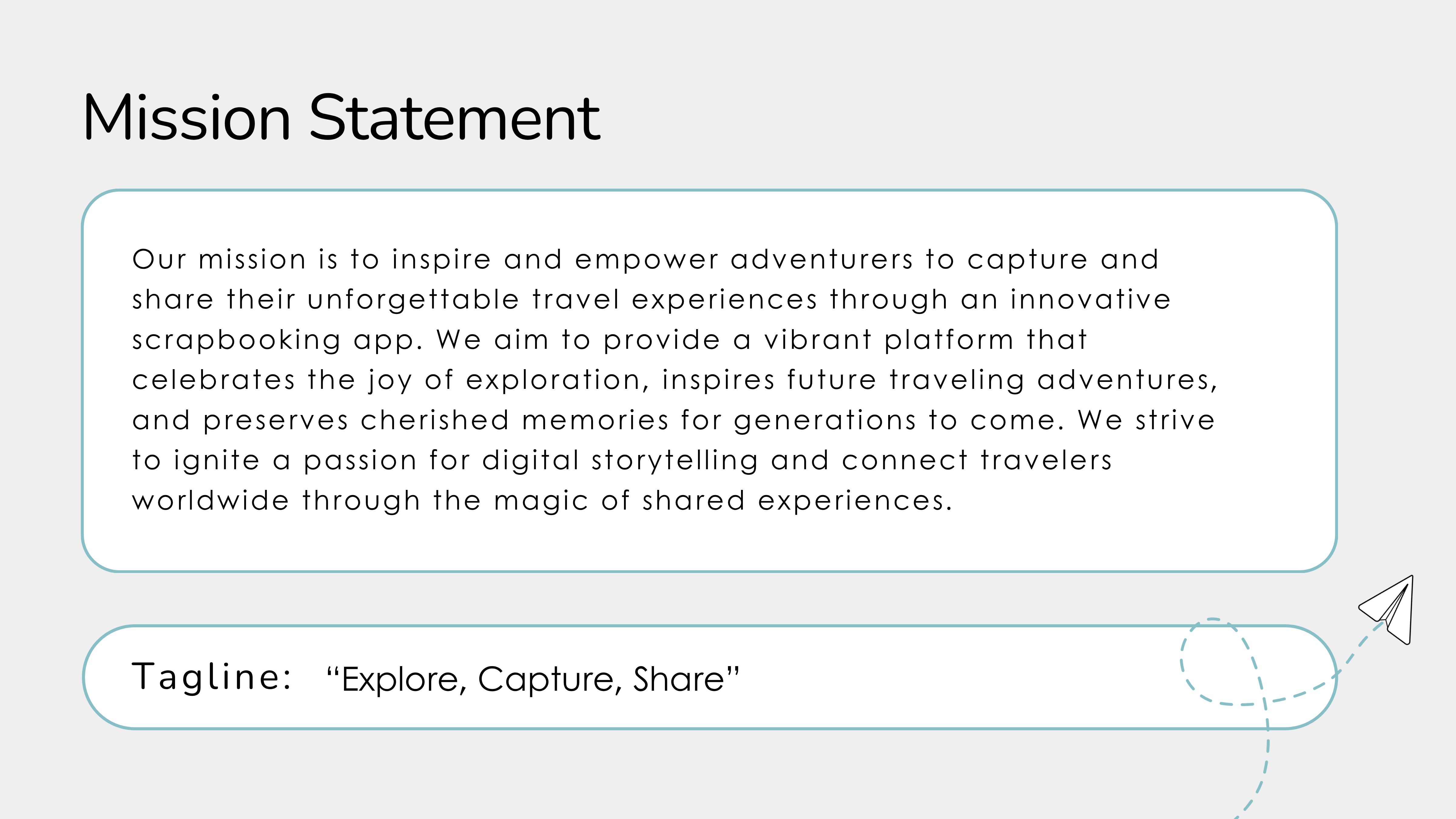
The mission centered on inspiring users to capture unforgettable travel experiences while connecting travelers worldwide through shared stories and digital creativity.

Mission Statement Tagline Brand Strategy Positioning
VentureVerse mission statement

Mission Statement + Tagline

VISUAL SYSTEM

Color Palette + Psychology

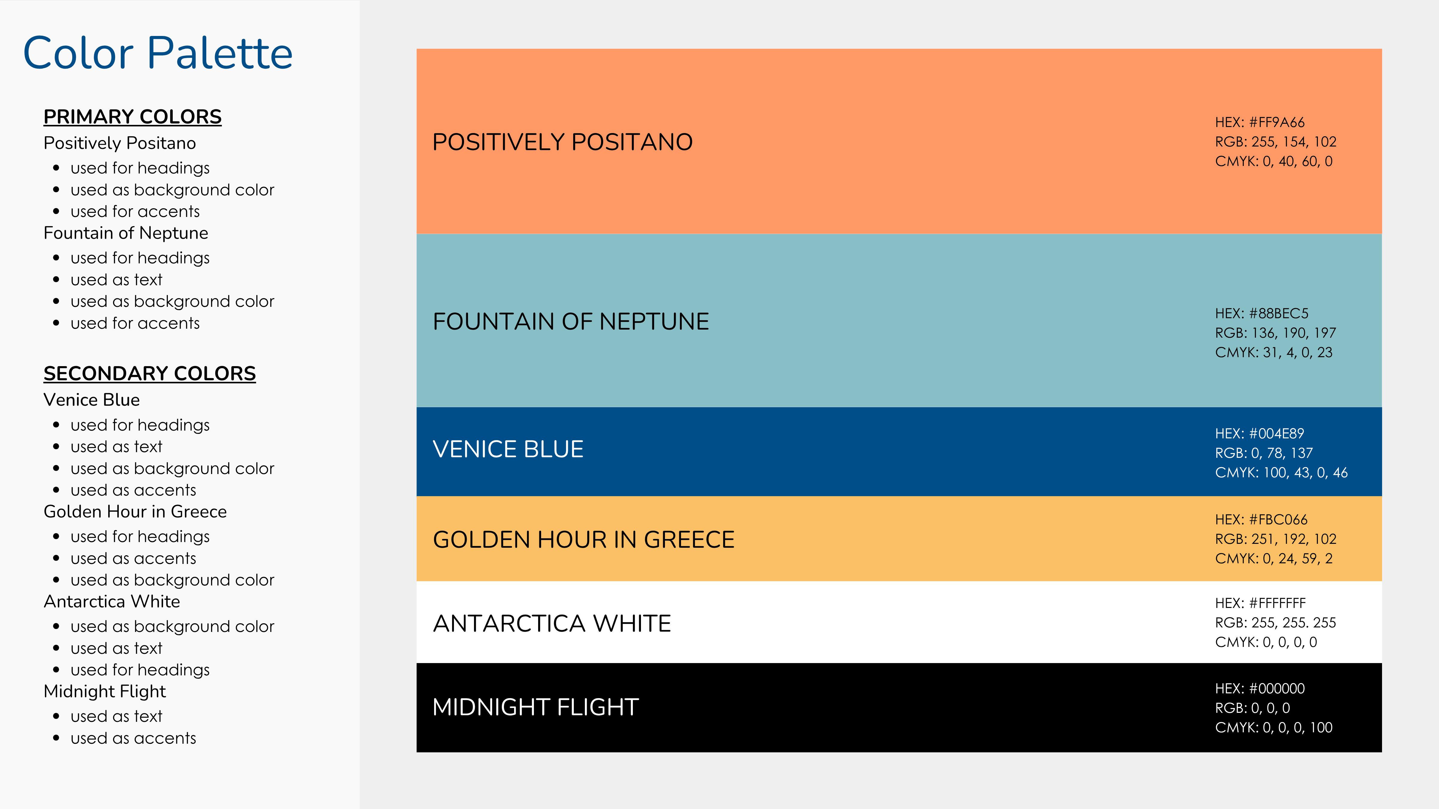
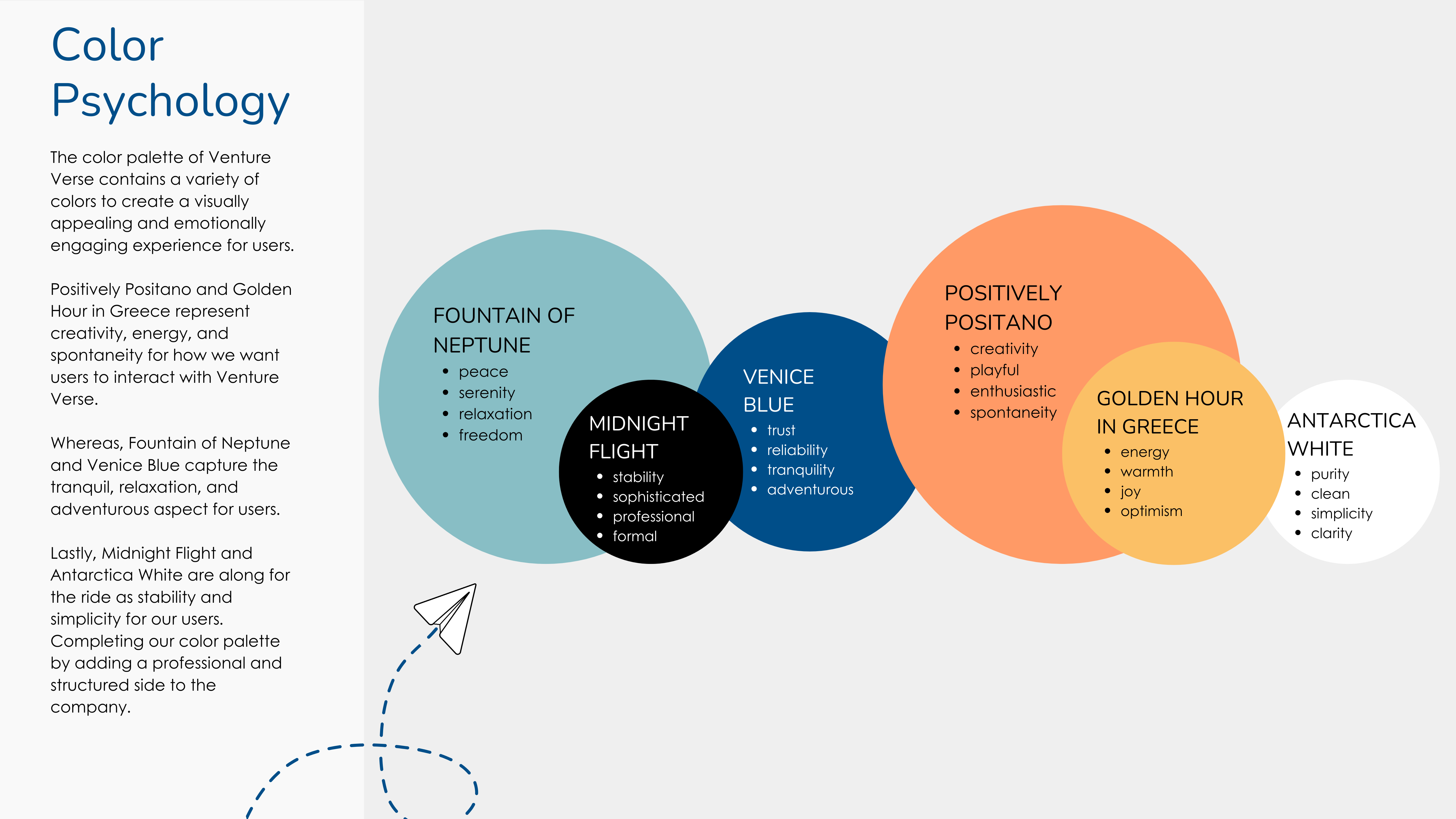
The palette balanced energy, creativity, calmness, and trust. Warm tones represented spontaneity and joy, while cooler tones reflected travel, serenity, and reliability.

Color Theory Psychology Accessibility Brand Consistency
VentureVerse color palette

Brand Color Palette

VentureVerse color psychology

Color Psychology

LOGO DESIGN

Flexible Brand Mark

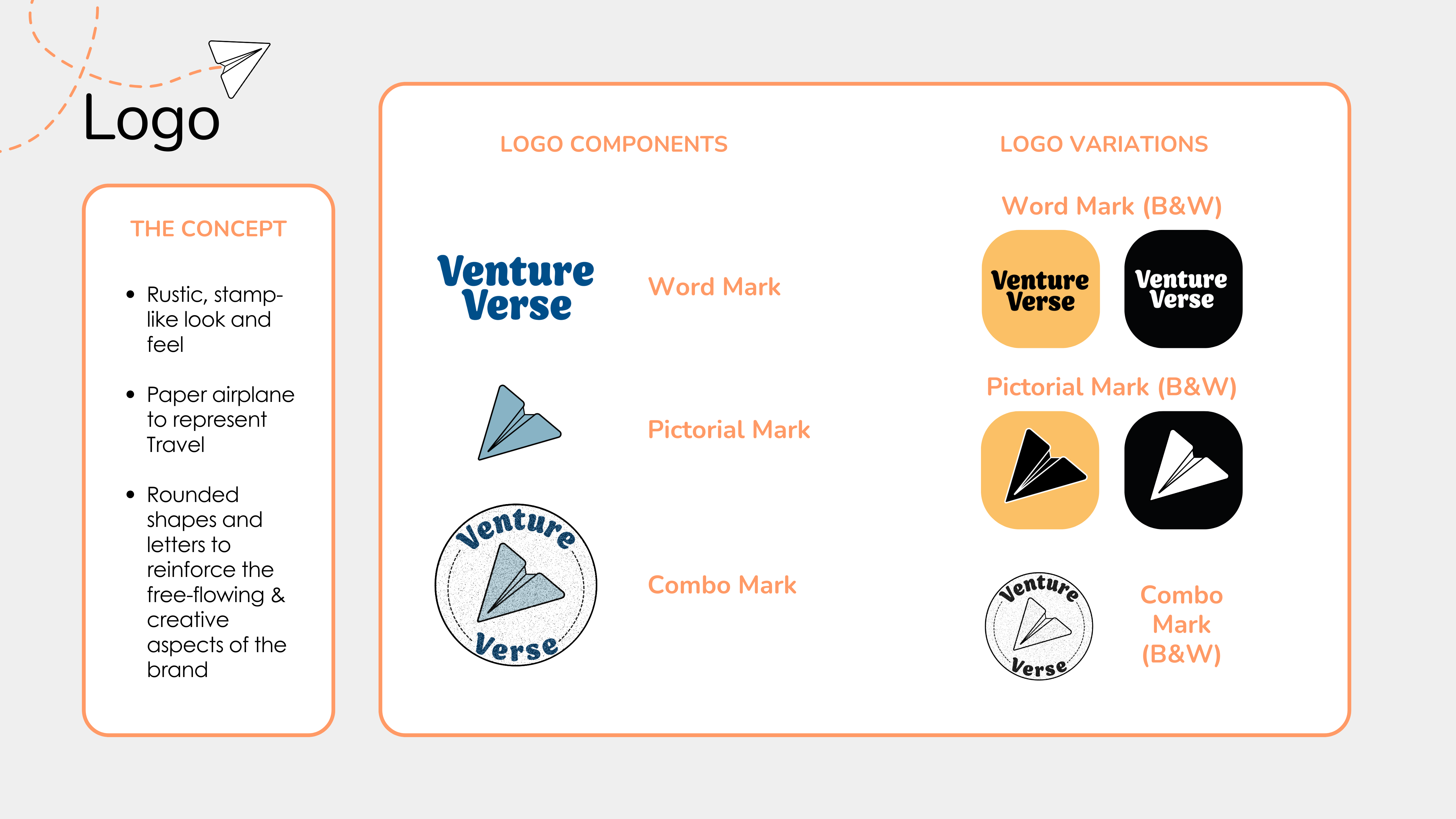
The identity system included a wordmark, pictorial mark, and combination logo. The paper airplane symbol reinforced movement and travel, while rounded shapes created a playful and welcoming feel.

Logo Design Wordmark Iconography Brand Usage
VentureVerse logo system

Logo Components + Variations

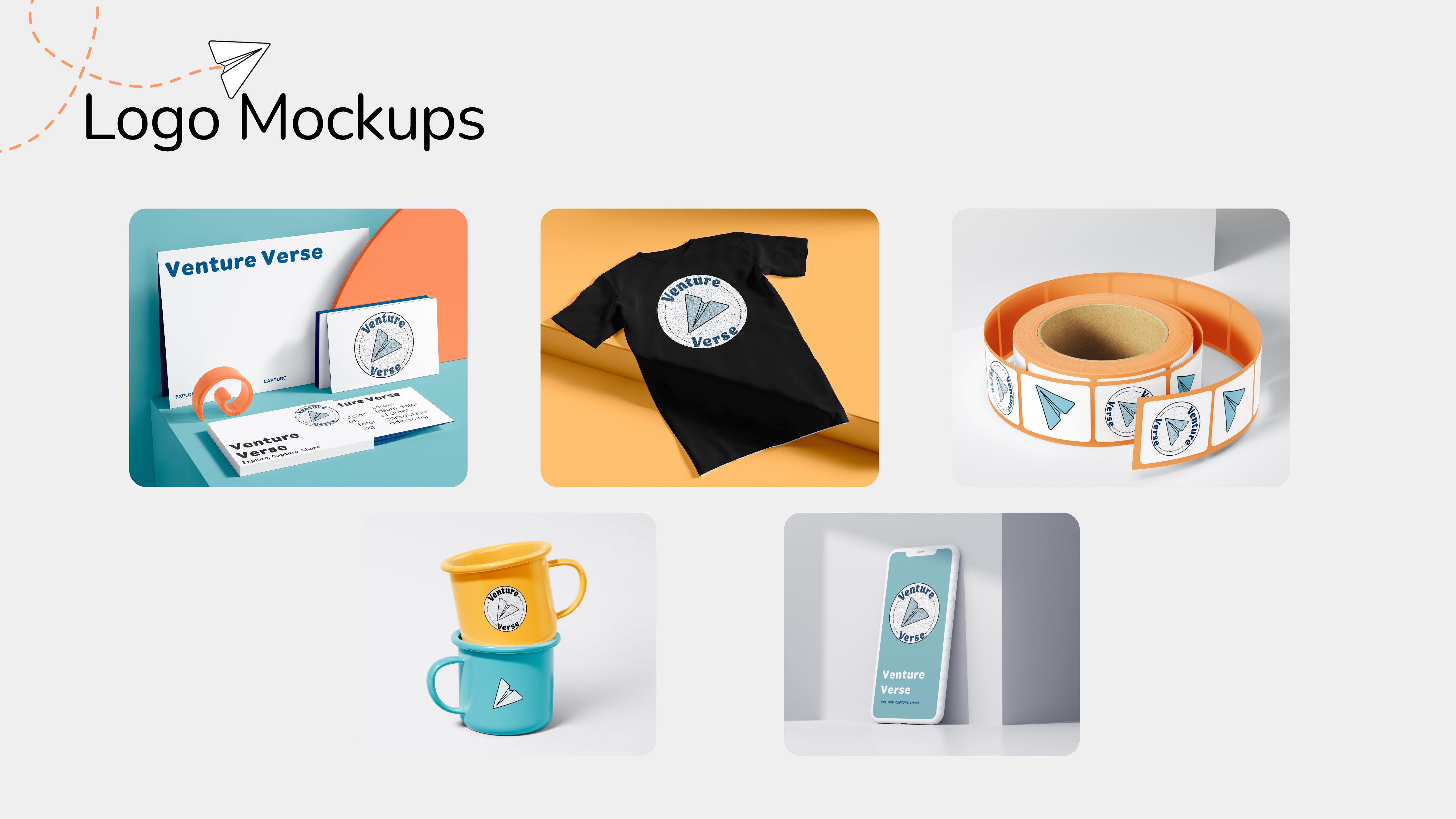
VentureVerse logo mockups

Brand Mockups

PRODUCT DESIGN

UI Components + Experience

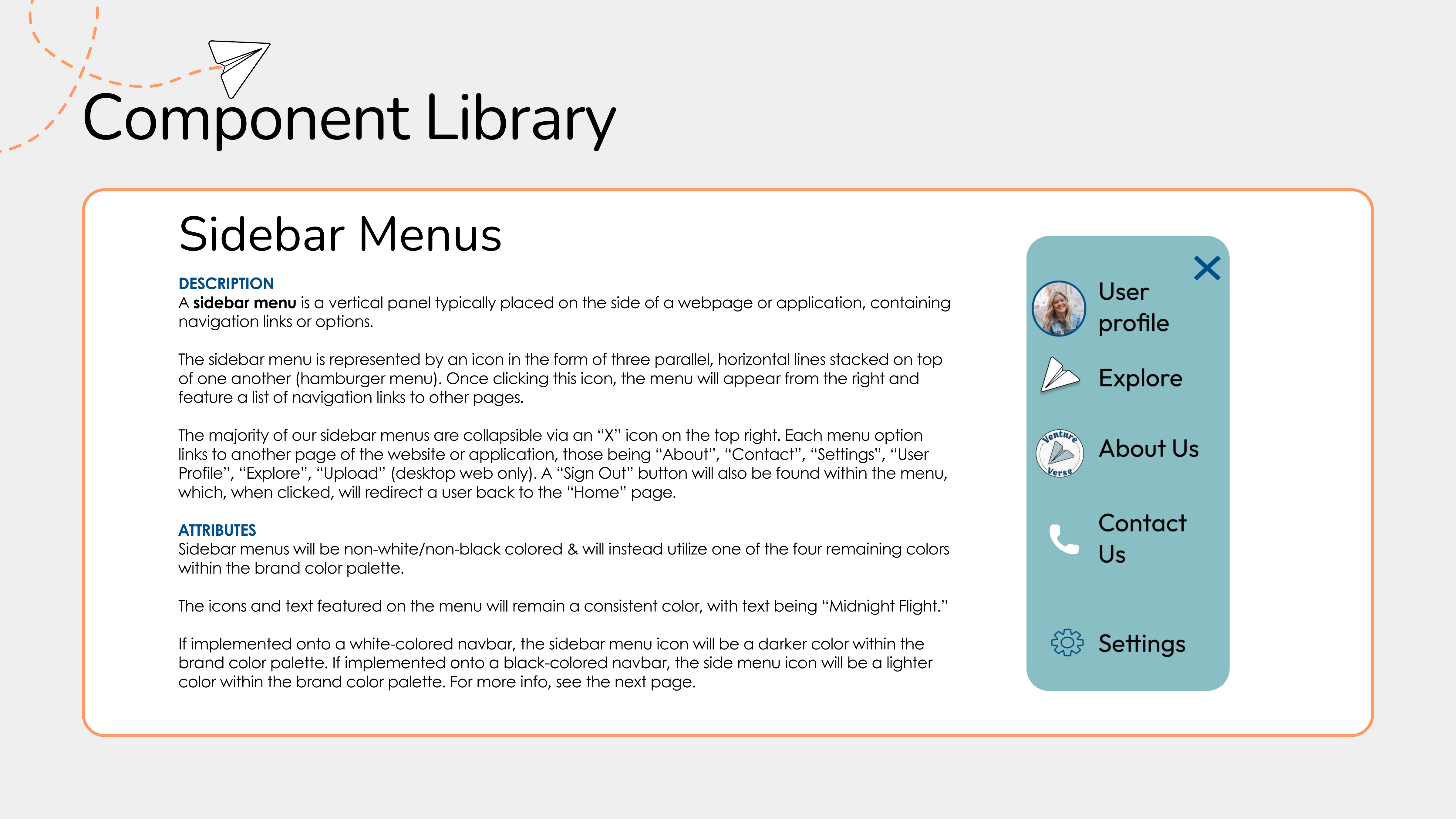
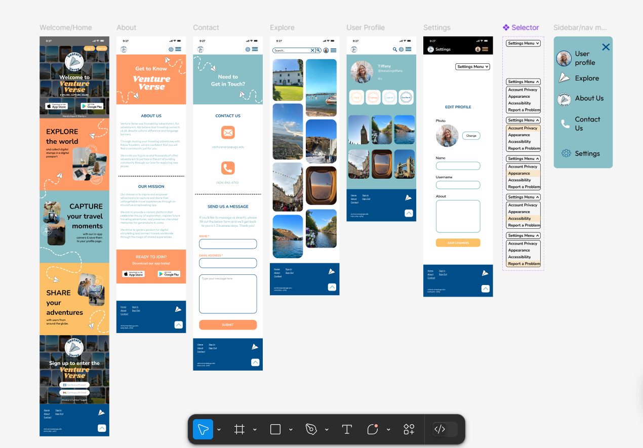
We created a component library to ensure consistency across the app and website. This included buttons, icons, dropdown menus, sidebars, navigation systems, and reusable interface patterns.

UI Design Component Library Navigation Reusable Systems
VentureVerse component library

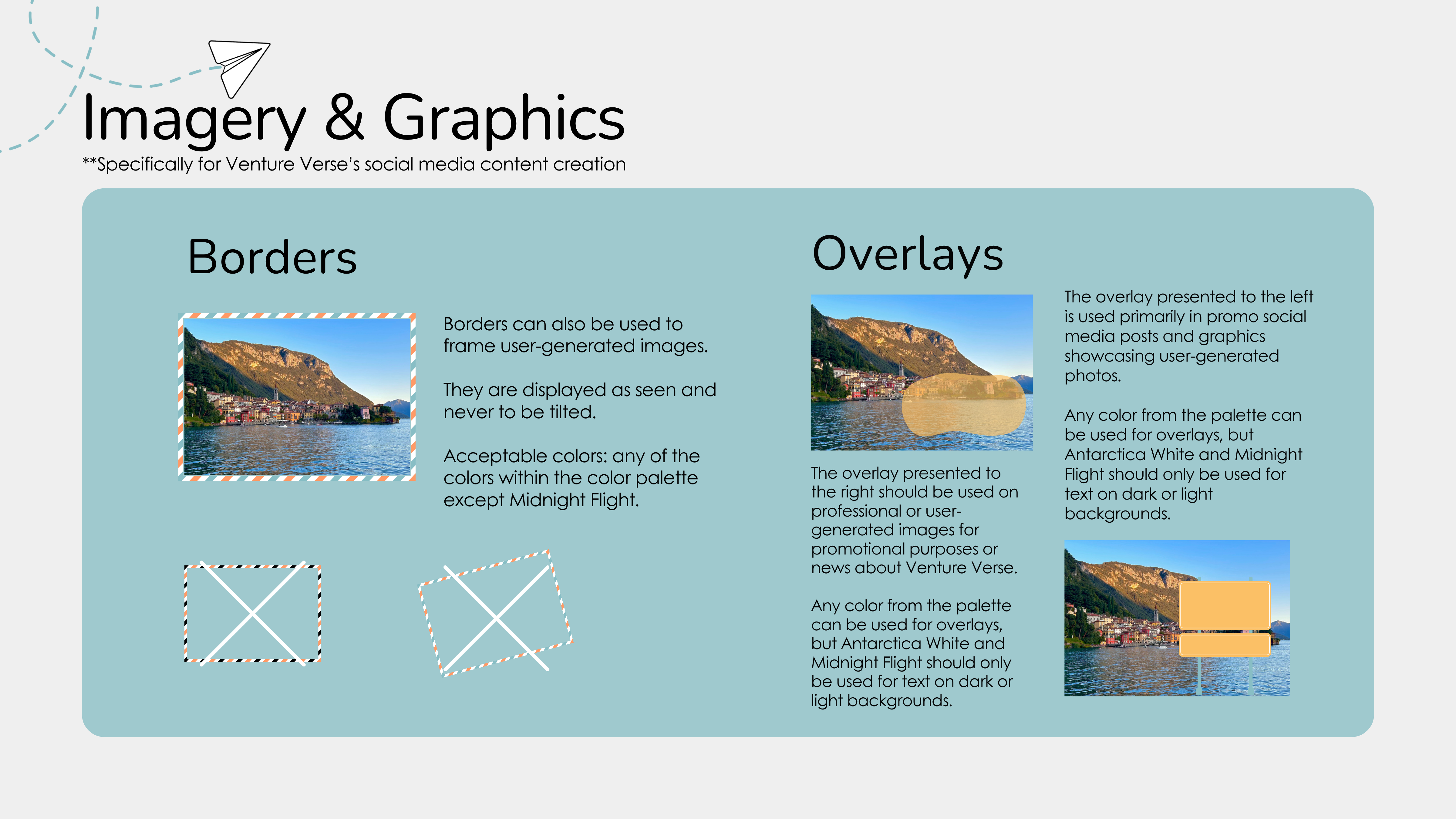
Imagery + Graphics

VentureVerse dropdown menus

Sidebar Menus

VentureVerse sidebar menu

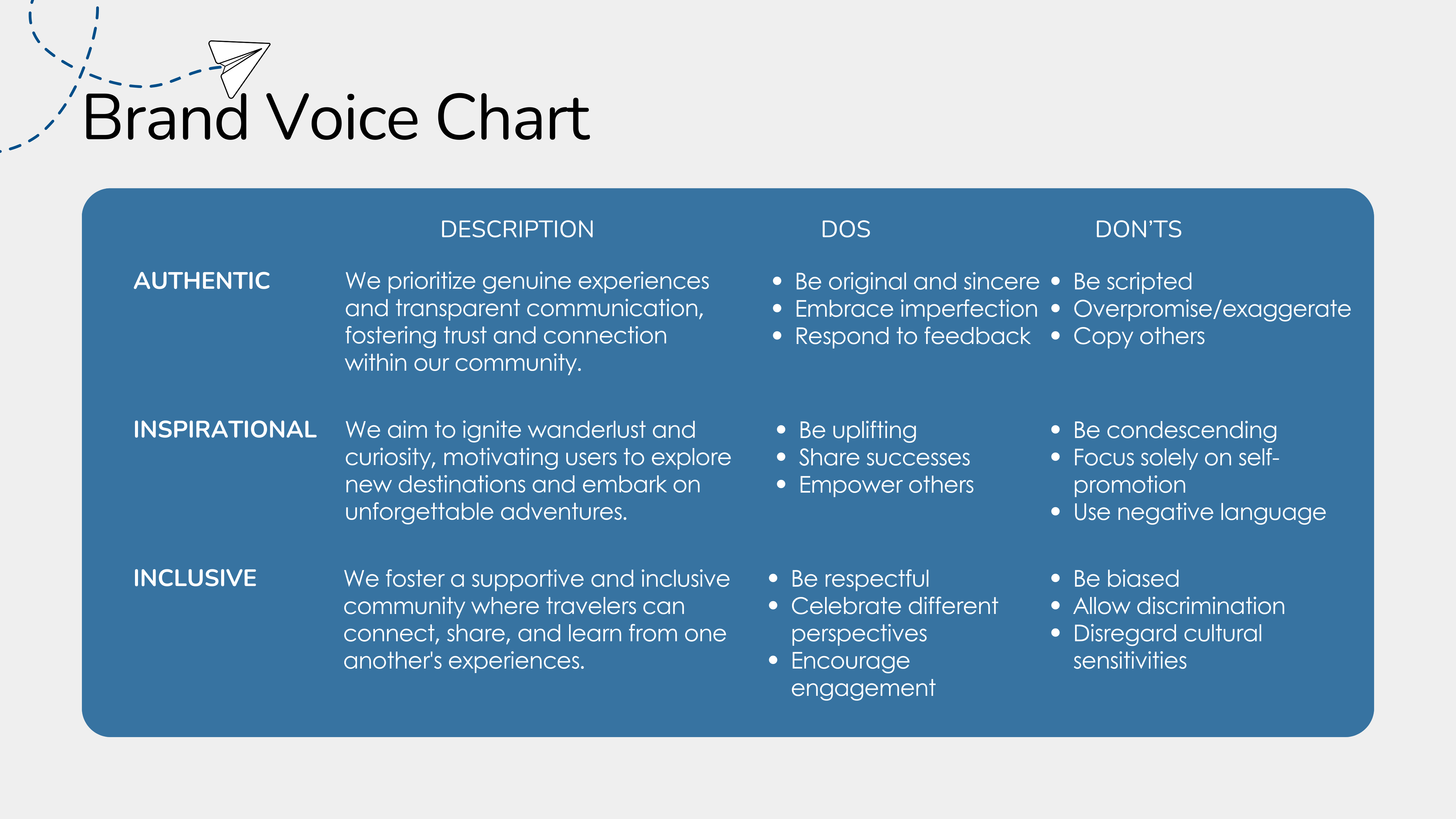
Voice + Tone

USER RESEARCH

Audience Personas

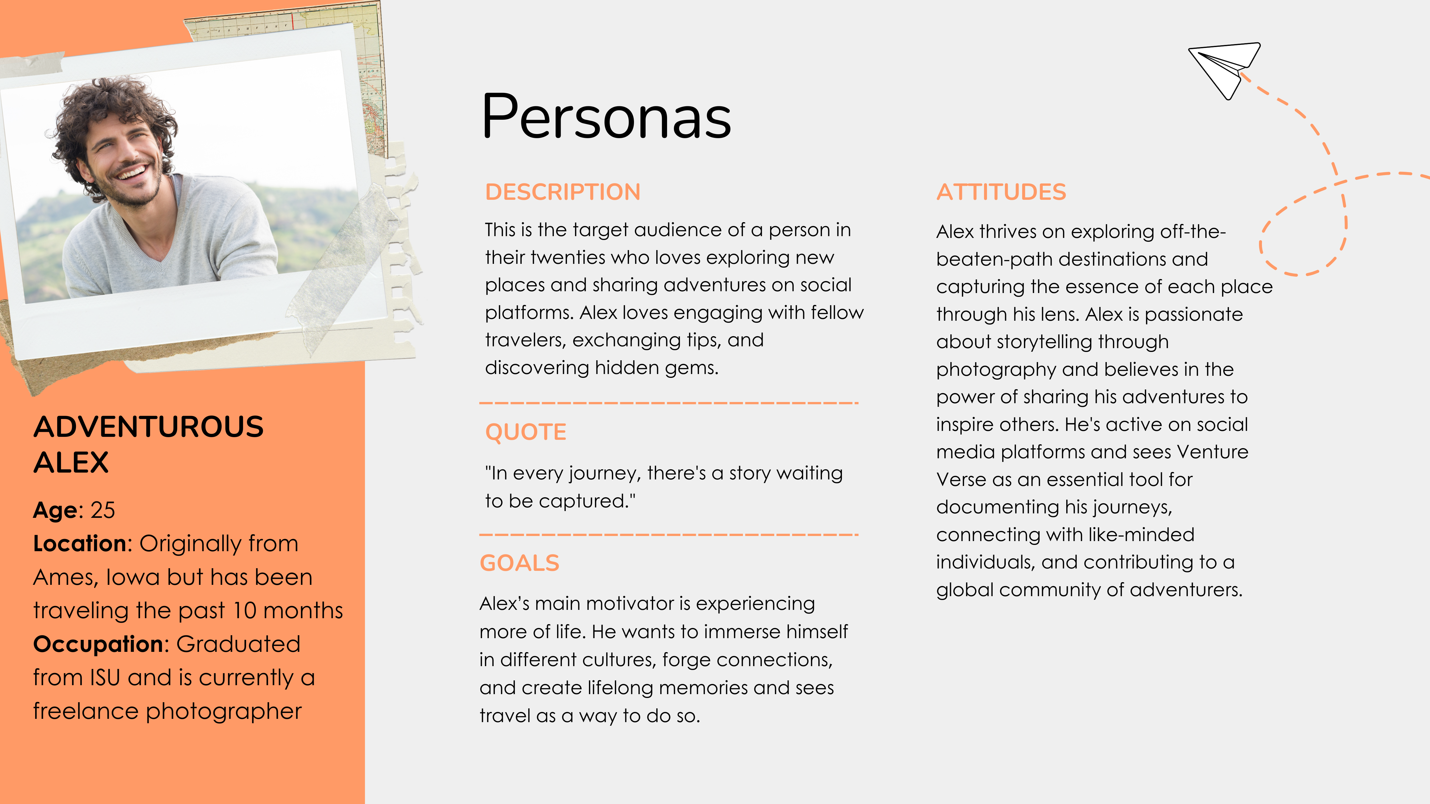
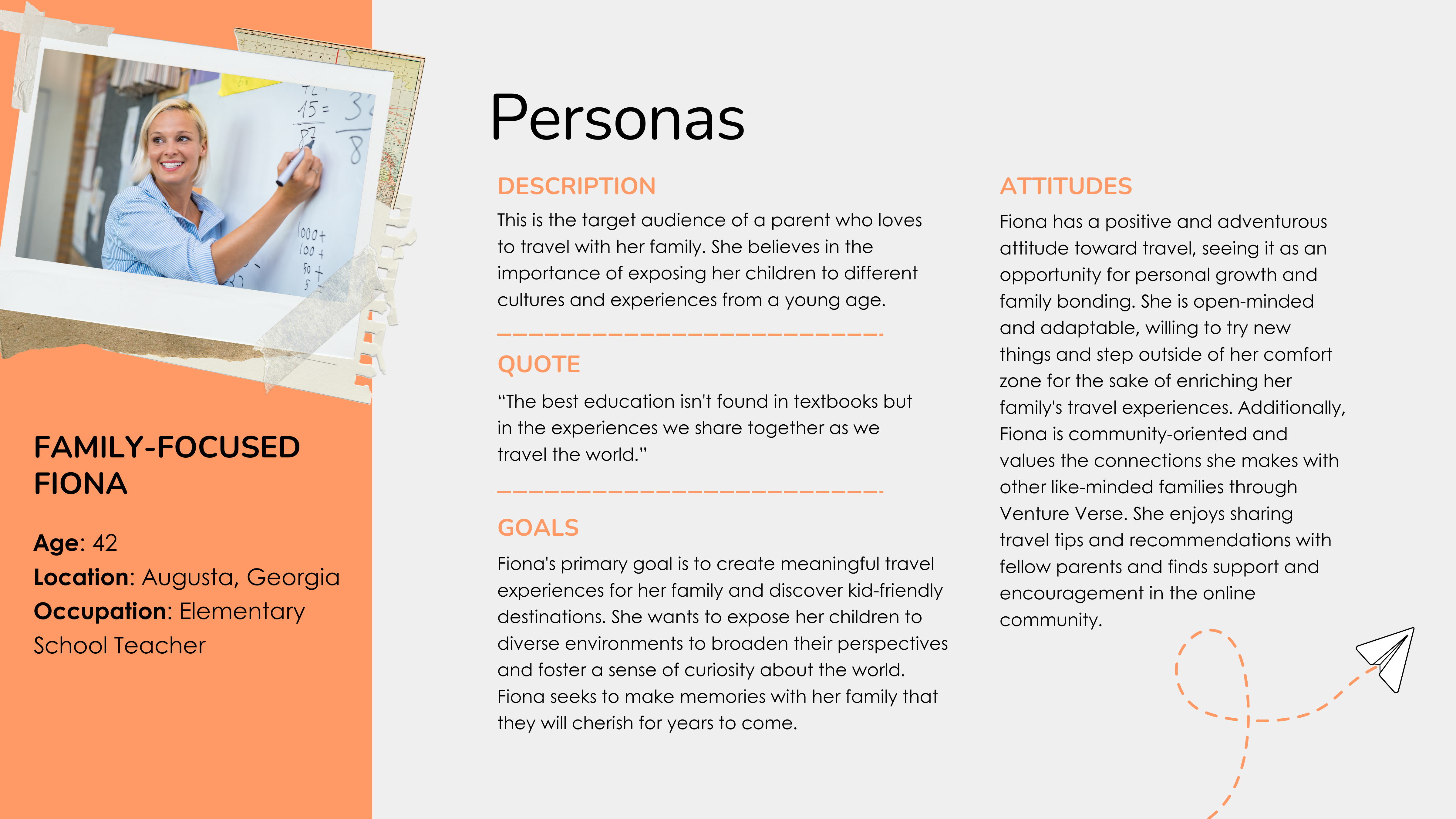
Personas helped define who the product was built for: adventurous solo travelers seeking inspiration and families wanting memorable, kid-friendly travel experiences.

User Personas Audience Needs Empathy Mapping UX Strategy
Adventurous Alex persona

Adventurous Alex

Family Focused Fiona persona

Family-Focused Fiona

Design Decisions

The scrapbook aesthetic influenced the entire experience through polaroid frames, tape elements, dotted travel lines, paper airplane graphics, and layered imagery. These details helped the product feel creative and emotionally tied to memory-making rather than transactional travel tools. :contentReference[oaicite:2]{index=2}

Takeaway

VentureVerse strengthened my understanding of how branding and UX work together. It challenged me to think beyond visuals and create a full product identity system rooted in user emotion, functionality, and storytelling.

REFLECTION

What This Work Taught Me

This project showed how strong branding can shape the entire user experience. From strategy and voice to interface components and imagery, every design decision supported the idea that travel memories deserve to feel immersive, personal, and worth sharing.